Tales of Arise DLC - CRM Email Campaign
Bandai Namco Entertainment
Designing a CRM experience for Tales of Arise DLC to drive product engagement/visibility and sales.
The Project: Building a CRM experience for Tales of Arise - Beyond the Dawn DLC via email that piques users’ interest and drives them to engage with the product and make a purchase.
Background
Bandai Namco is a leading video game developer well known for their products specifically in the JRPG niche. With the upcoming release of a DLC expansion for the popular title “Tale of Arise”, the video game development and marketing teams are seeking to reach existing users via email to encourage purchase of the expansion.
Time & Scope
Discovery & Early Research
Competitive Analysis
User Research
Iterative Design
Experimental Launch Testing
Time: 1 month
Tools:
Project Management: Asana
Design: Figma, Adobe Creative Cloud
Testing: Maze
Collaboration: Zoom, Slack
My Role
For this project, I was the sole designer assigned to this project - as such, I acted as design lead, user researcher, content designer, product manager, and advocate for the user’s experience. Apart from receiving initial visual asset materials from the development team, I acted independently apart from the feedback phases and handoff for implementation.
User Interviews + Preliminary Research, Competitive Analysis
Brainstorming + Whiteboarding, Early Ideation
Interaction Design and Content Strategy
Iterative Design Approach: Double Diamond
A/B Testing and Product Launch
What I Did
Context
Tales of Arise is a critically acclaimed JRPG video game title published by Bandai Namco Entertainment in 2021. Following its success and popularity, the development team for the title created a DLC expansion called “Beyond the Dawn” that included additional content and an extended story line.
Given the somewhat niche market for JRPG video games, it was paramount that the Tales of Arise team engaged with pre-existing players who already owned the title and were already invested into the story & world of the game - since they would be the first, and most important, user persona for product sales.
With a large uptick in online purchases, both for console and PC platforms, the team identified that they could easily market to pre-existing players via registered user accounts and emails.
How might we build a CRM experience for Tales of Arise - Beyond the Dawn DLC via email that piques users’ interest and drives them to engage with the product and ultimately purchase it?
The Problem Space
Early on, it was important to clarify the guiding business goals and objectives in order to clearly understand what might be needed in an optimized email design. With a specific targeted demographic of pre-existing players, and a goal to reach as many users as possible, it was important to create a design campaign that could be adaptable to multiple platforms.
Since the focus was specifically on CRM and driving engagement and ultimately sales, I established early prioritize the process:
click-through rate, engagement, clear CTA, original designs, responsiveness
This helped to establish requirements that I could use a checklist as I went through the design process:
Heavy usage of product branding + assets
Clear CTA to drive engagement
Original design that creates a sense of adventure and excitement
A structure that entices users to continue scrolling through the content
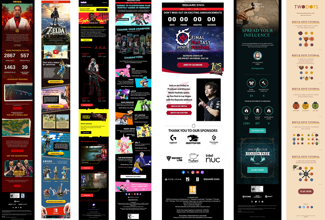
What are others doing?
A CRM email campaign is nothing new. But that means that there is tons of existing content to learn from!
I mainly focused on game catalogs, news forums, newsletters, and other digital media relating to game news/launches, since those were the most relevant to the project.
I looked at competitors like Nintendo and Blizzard, as well as internally at Bandai Namco’s previous works, to gain a deeper understanding of industry standards and norms.
Research Takeaways
Based off of this preliminary research, alongside some early competitive analysis and table research, I was able to identify some key characteristics that had to be in the CRM experience:
Logical Flow:
a clear structure with images and CTAs to guide flow are important to keep users interested and engaged
Keep It Concise:
be mindful of vertical length and amount of text ... users don’t read everything and want to digest info as quickly as possible
Drive the User:
CTA buttons should stand out and should enable users to perform the most important actions (buy, see trailer, etc.)
Point Out Key Details:
highlight important details like launch dates, deadlines, prices, etc.
Setting Up for Success
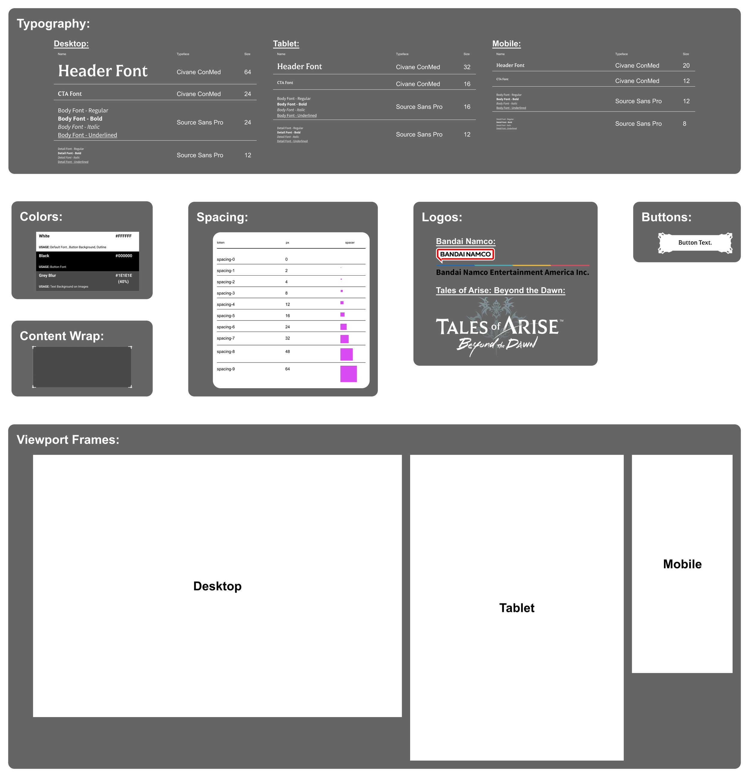
With my first round of research complete, I felt ready to start the design process. Already knowing that the final product would need to be responsive, so as to be adaptable to different devices, screen sizes, and platforms, I felt that it would be wise to begin by creating a small design system to keep components both visually and technically consistent - which would make it much easier to implement in the long run.
The design system established a simple set of guidelines that I could follow rigidly to ensure visual consistency, cohesion, and clarity. Components were simple, as this was for an email campaign design. They included:
Typography
Colors
Sizing
Buttons and Content Frames
Viewport Sizes
Early Designs and Iterations
The campaign needed to feel exciting and adventurous! Early on, I knew that stacked boxes and vertical scrolls could feel pretty boring … but working with static emails proved to be technically limiting. This led to 2 early design decisions that would guide me through the iterative design process:
Create visual movement through dynamic shapes and diagonal lines to avoid a sense of structure and regularity
Let the DLC’s content (images and videos) drive the majority of the content, since that’s what players want to see anyways
The first draft focused on allowing myself to let my initial ideas come to life and getting the critical information/content onto the designs. It was very bare-bones. After getting those ideas on paper (metaphorically - everything was on Figma), I immediately identified opportunities for improvement and growth.
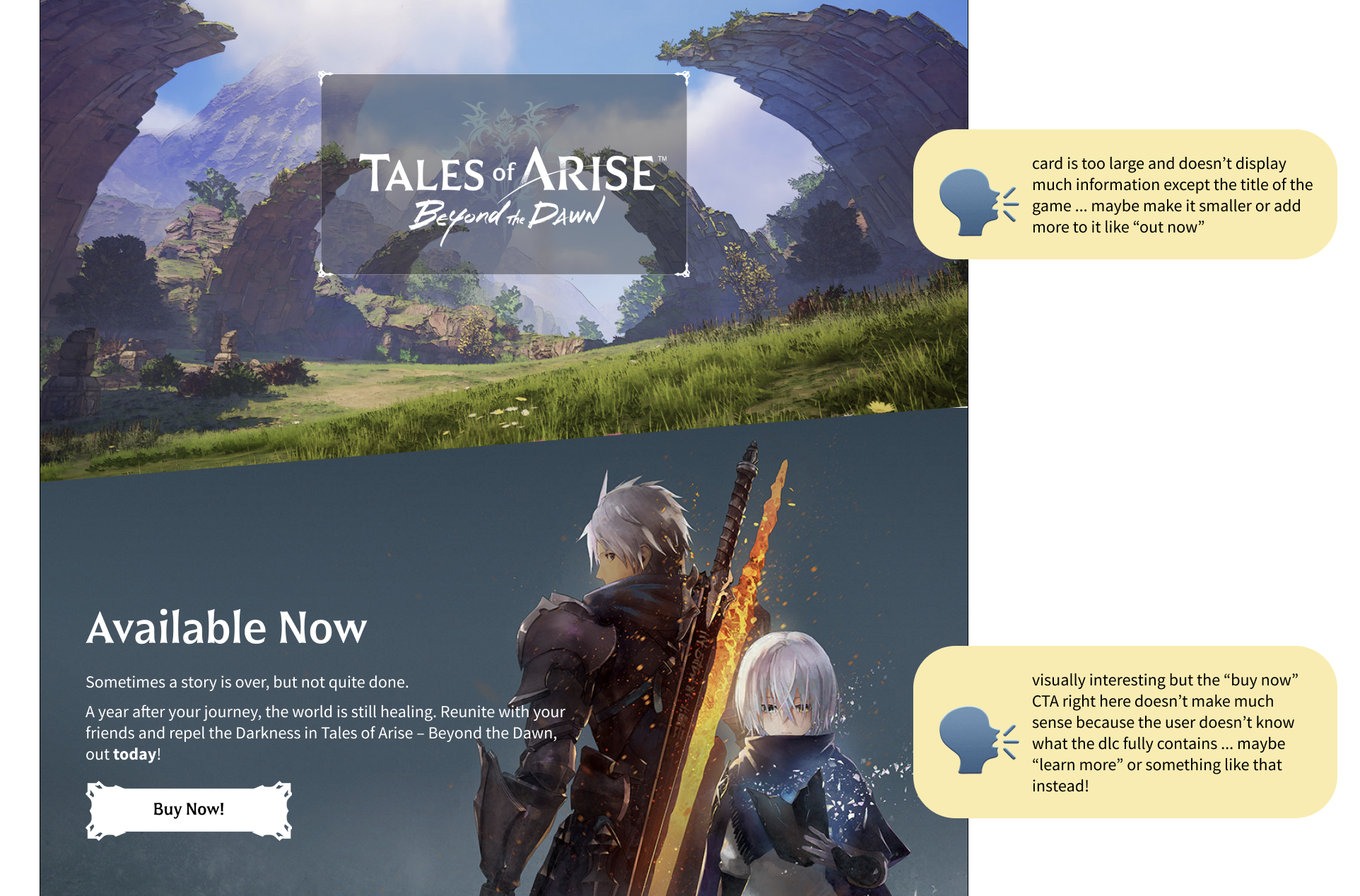
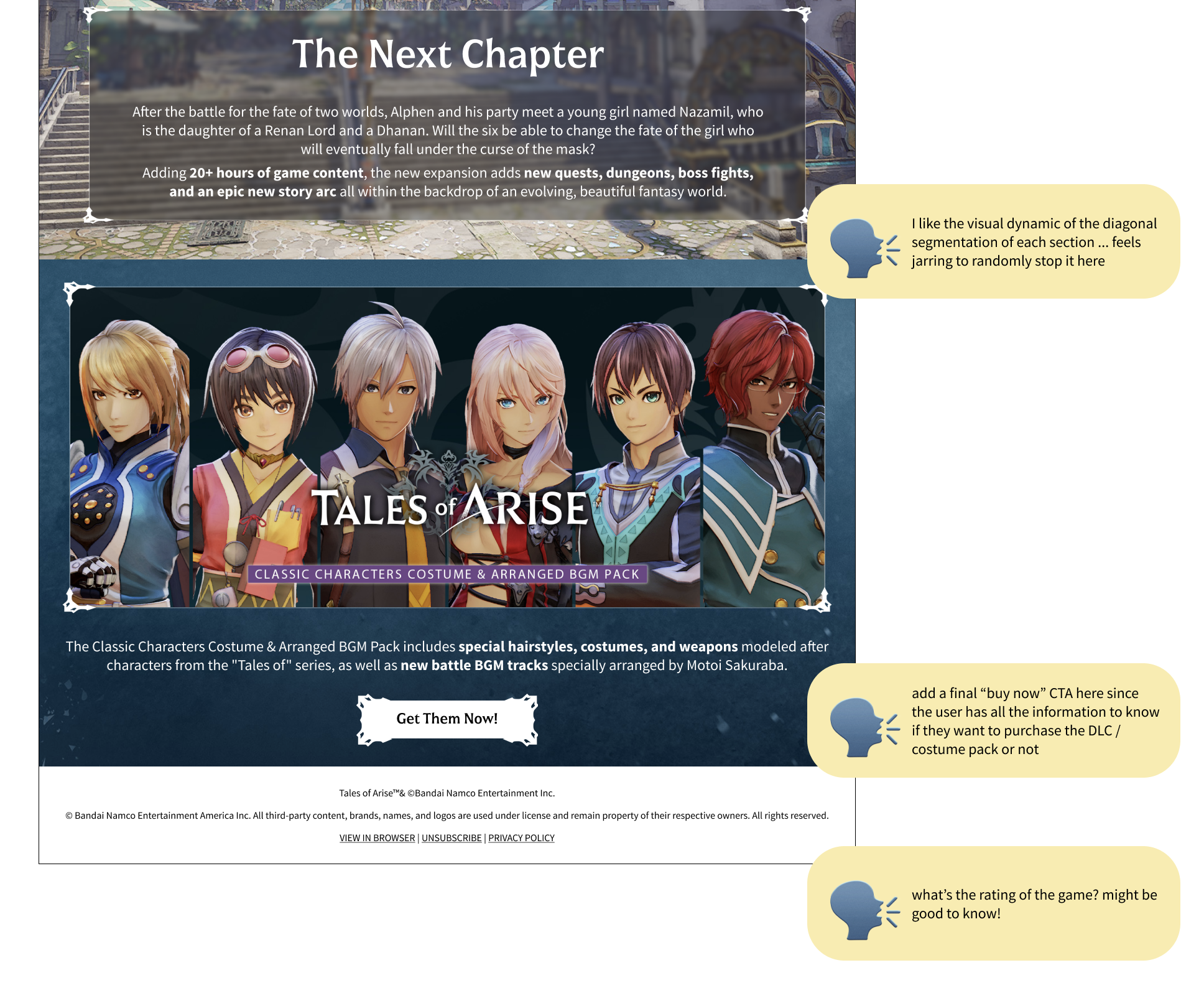
Early testing also showed that, while users were interested in seeing the game’s content, there weren’t many opportunities to actually go to the “purchase” screen until the end.
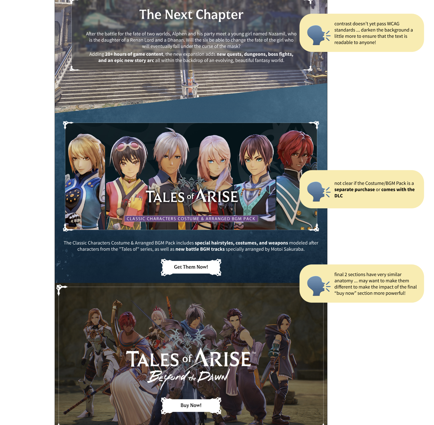
The second draft allowed me to apply much of those ideas for improvement as well as feedback from early testers in order to improve click-through rate and provide more CTA buttons so users felt more compelled to purchase. At this phase, I also worked on visual refinement to consider things like accessibility and WCAG compliance, structural anatomy of the design, and content clarity.
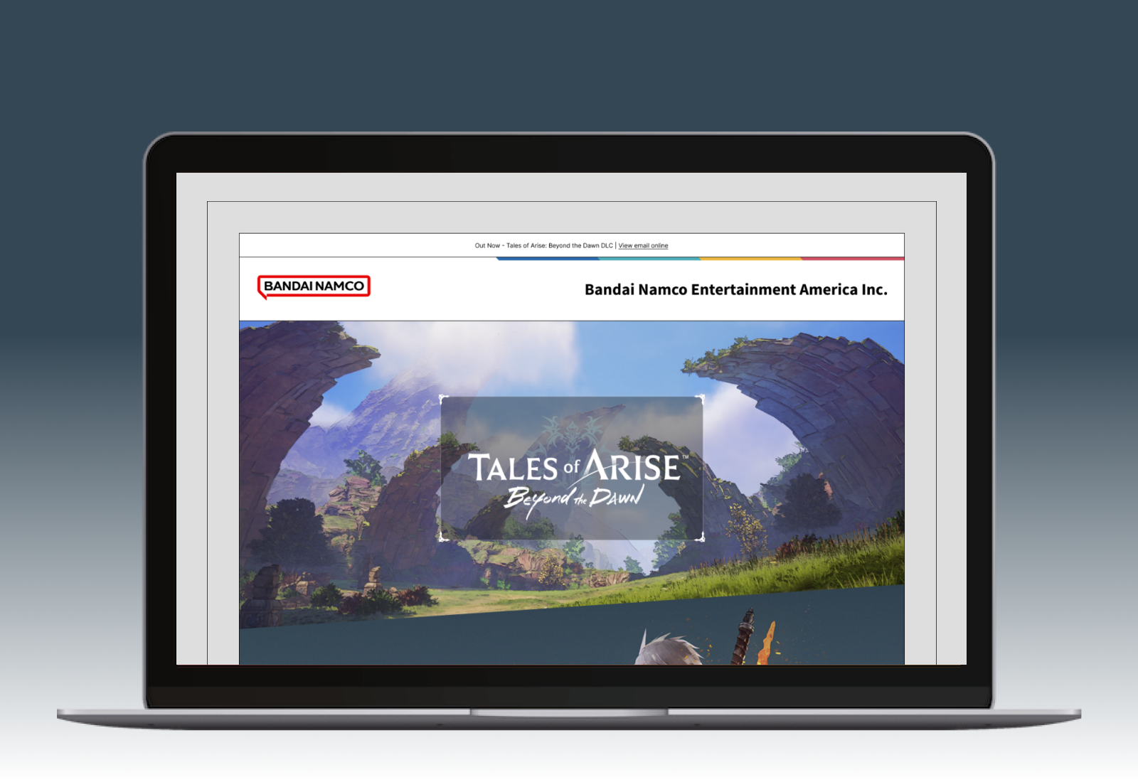
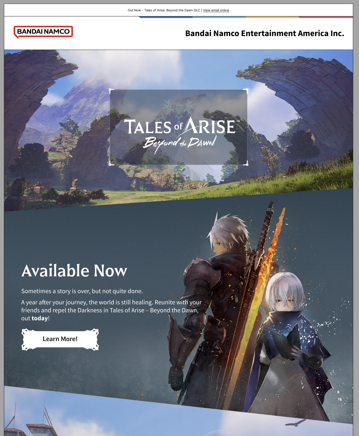
Final Designs and Launch
After going through multiple rounds of design iteration and user testing, I eventually landed on a final design draft that created a sense of excitement, not only for the users, but also for me and the Bandai Namco team. Once approved, I worked on using the base design and creating versions for each viewport. This way, the design would be responsive to different viewport widths.
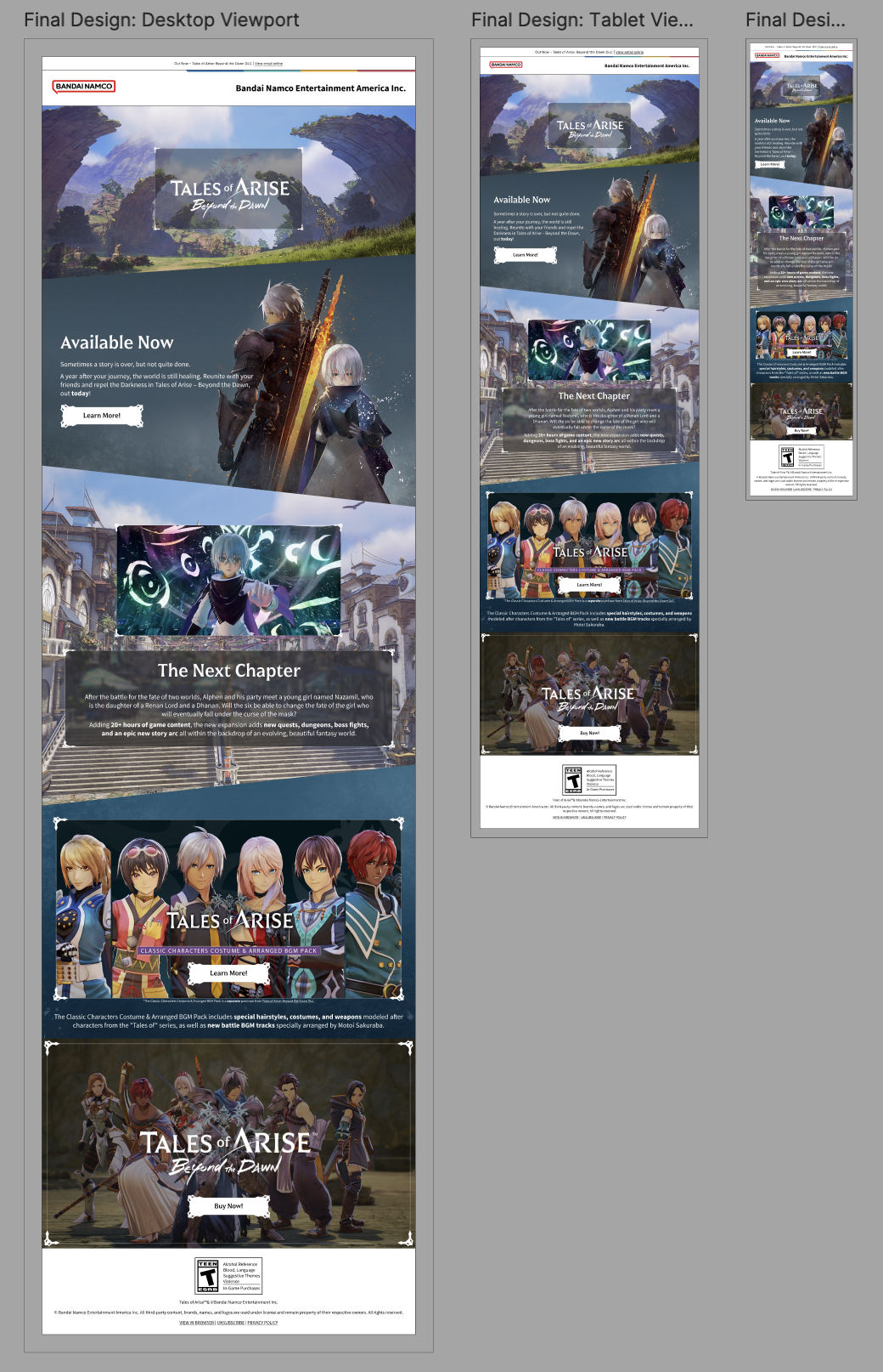
Upon approval and final testing, we saw that users had an increased sense of excitement for the product, had much more positive feedback, and on average scrolled further down the email design and had an increased rate of clicking on the “purchase” CTA.
Impact
This email campaign proved to be very successful! It met the requirements established early on in the design process and increased visibility for the DLC to the target demographic. I received great feedback from the Bandai Namco team and was affirmed that these designs had a large impact: